UI-UX design
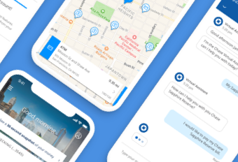
Enhanced chat for Chase mobile
JP Morgan Chase, 2019
project overview
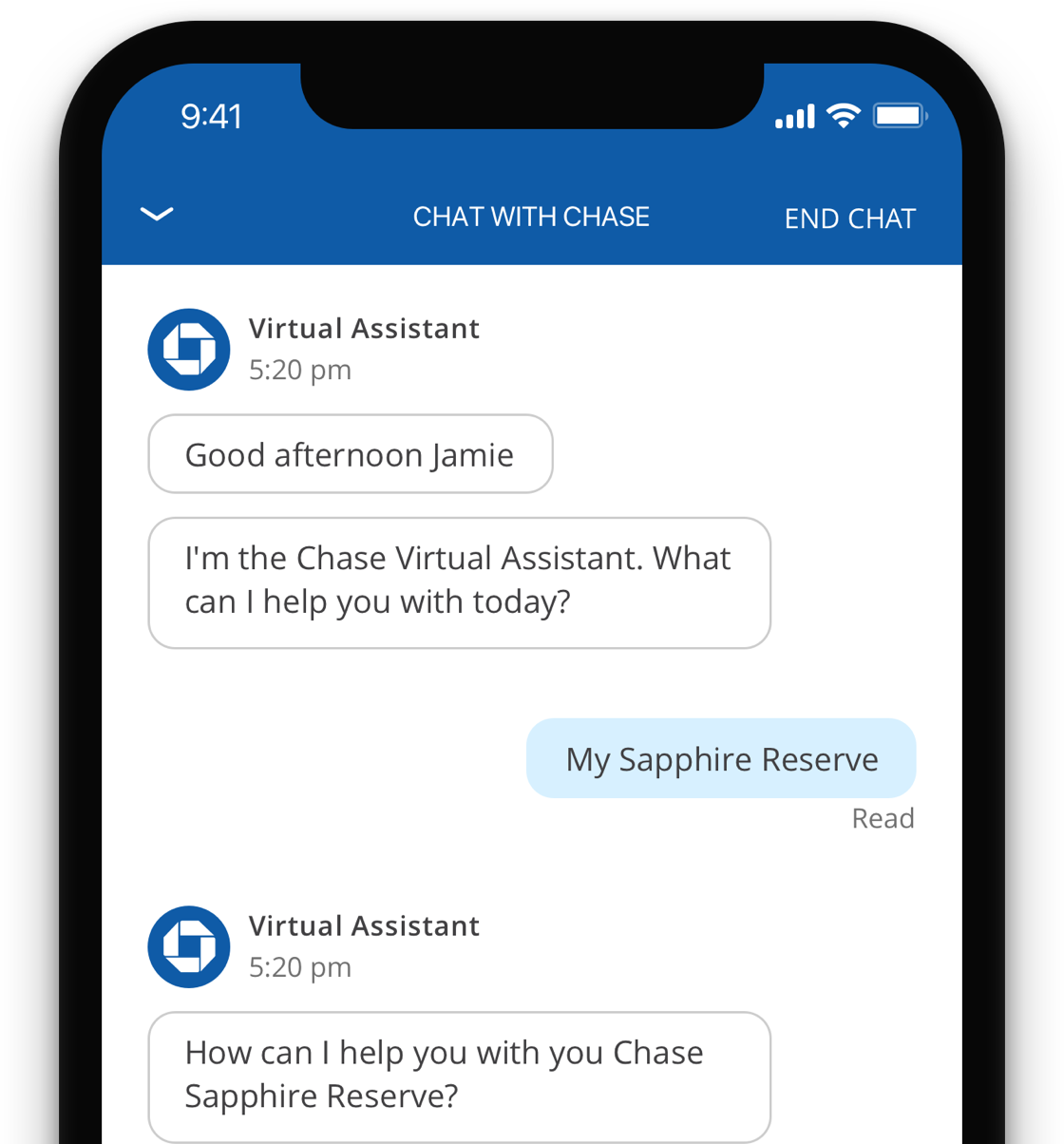
This feature is part of an effort to increase self-service options in the Chase mobile app. It consists of a virtual chat bot that could help with common banking tasks and if needed, escalate users to a live agent. My role was designing the way this feature lives, looks and behaves in the app.
project overview
This feature is part of an effort to increase self-service options in the Chase mobile app. It consists of a virtual chat bot that could help with common banking tasks and if needed, escalate users to a live agent. My role was designing the way this feature lives, looks and behaves in the app.
PROJECT OVERVIEW
This feature is part of an effort to increase self-service options in the Chase mobile app. It consists of a virtual chat bot that could help with common banking tasks and if needed, escalate users to a live agent. My role was designing the way this feature lives, looks and behaves in the app.
Entry point and motion explorations
Entry point and motion explorations
Explorations on some entry points and how the chat window, bubbles, and typing indicator could appear and behave.
Card carousel
Demonstrating the interactions and behavior for a card carousel. It is meant to be used in scenarios when the chat bot is asking which one of the user’s credit cards need to be replaced, in a visual way.
Chat window persistence explorations and user testing
Chat window persistence explorations and user testing
One navigation problem I had to solve was the best way for a user to minimize the chat window in order to do something concurrently in the app while engaged with a conversation.
USER TESTING
I prototyped three different approaches for keeping the chat window persistently minimized in the app for testing with users. I used a scenario where the participants wanted to “Transfer money” and the chat bot needed to link them to the feature in the app.
I wanted to find out if participants would notice the chat conversation was still running and minimized in the background. And, get feedback on what approach they most preferred.
OPTION 1: RED DOT
In the first approach, the chat screen animates away and there is a persistent chat button with a red dot appearing in the navigation bar.
Tapping on the button reopens the chat and continues the conversation the user was having with the chat bot.
OPTION 2: FLOATING BUBBLE
In the second approach, the chat screen shrinks down into a blue bubble in the bottom right corner. Users can move it around with a drag gesture if it becomes intrusive with other UI elements.
Tapping on the bubble reopens the chat and continues the conversation the user was having with the chat bot.
OPTION 3: BLUE BAR
In the last approach, the chat screen animates to the bottom and becomes a blue bar with a call to action to “Resume chat with Chase.”
Tapping on the bar reopens the chat and continues the conversation the user was having with the chat bot.
USER TEST FINDINGS
Participants found the “bar” option to be the most apparent and least intrusive approach for indicating the persistence of chat.
The red dot was the least effective method and participants found it forgettable. Users need some kind of affordance to indicate any gestures of draggability or swipe-ability in an user-interface element.
The bubble approach was a close second but participants found the bubble to be intrusive and they were not aware it could be moved.
Portfolio
Career exploration for Workday's Career HubProduct Design
Real-Time AI AlertsData Visualization
AWS Glue StudioUX Case Study
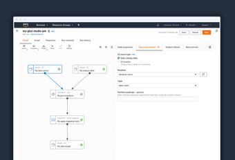
Visual authoring interface for AWS Glue StudioUX Case Study
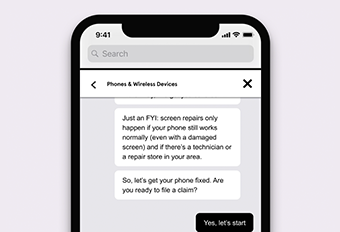
Asurion Virtual AgentUI Design
Chase mobileUI-UX Design
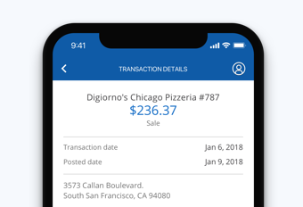
Transaction details for Chase mobileUX Case study
Upgrade systems for Rival FireUX case study
UI for James Bond 007: World of espionageDesign system